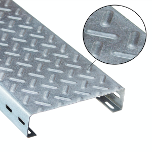
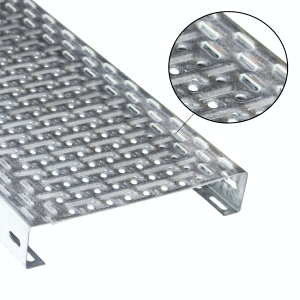
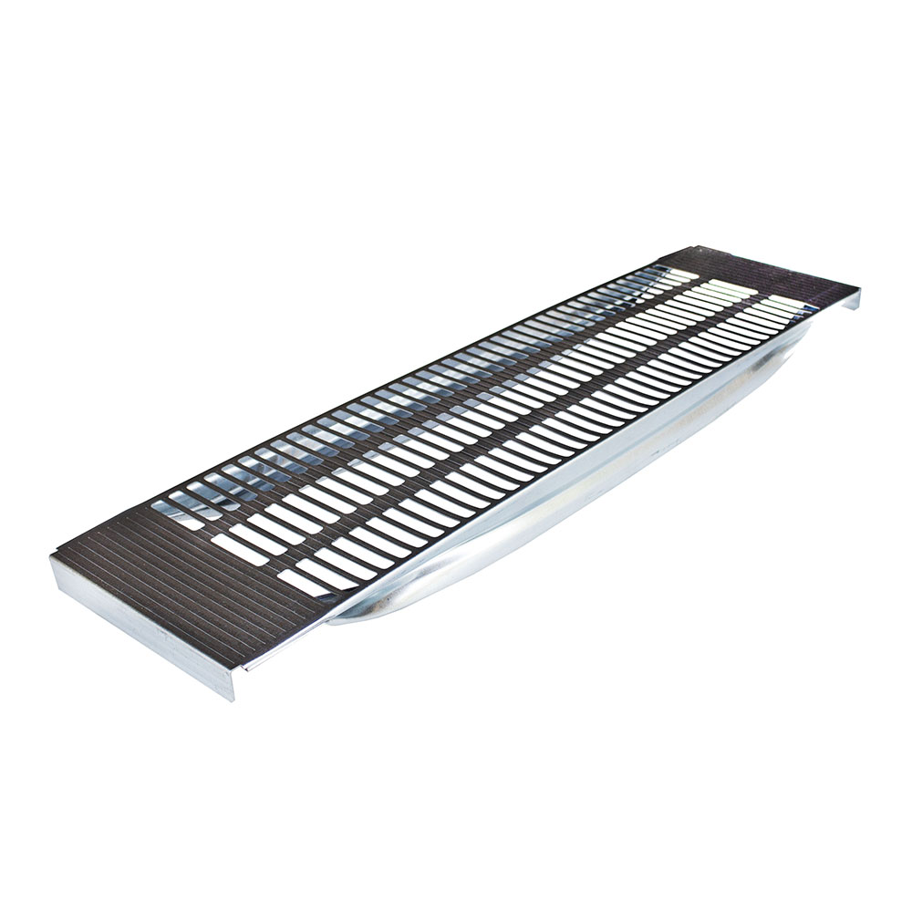
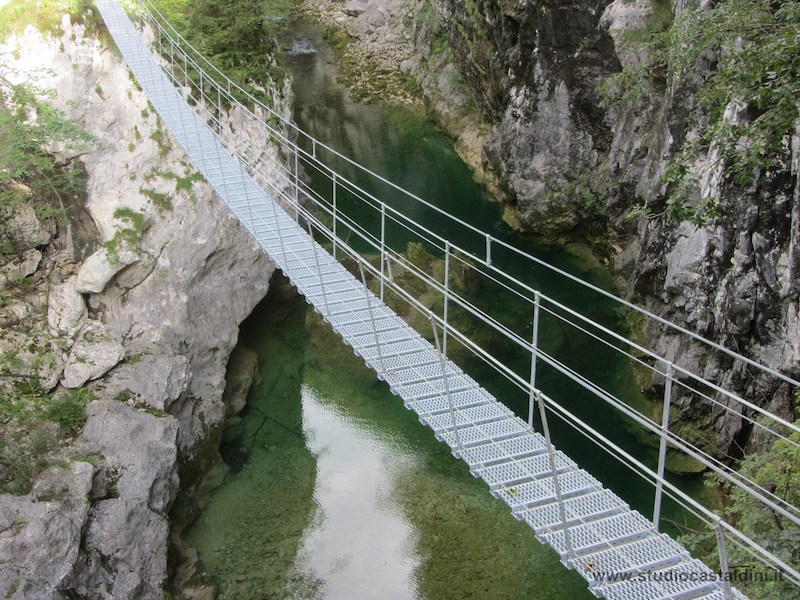
It’s restyling time for the Abagrigliati brand: brand new logo and website for our company, which has been reconfirming its solid identity in the world of gratings and components for shelving since 1975.
Yellow is the colour of energy and dynamism, while blue stands for security, balance and credibility. The pictogram recalls the structure of the gratings, flanked by three small circles symbolising perfection and completeness. 3, like the brothers who continue with passion and professionalism the management of the company founded with foresight by their father more than forty years ago. All this is accompanied by the payoff “Forging ideas since 1975”, which highlights the true pillars of Abagrigliati: specialisation in metalworking and historicity.
Our new website is also the result of times in which technology offers users increasingly comprehensive and optimal web spaces for navigation. Because our first concern, in every facet of the work we do every day, is your satisfaction. So welcome, once again, to our world made for you.


